EIA, the US Energy Information Administration, has just released a very interesting chart which demonstrates the flows between the primary energy sources and the sector which uses that specific source of energy.
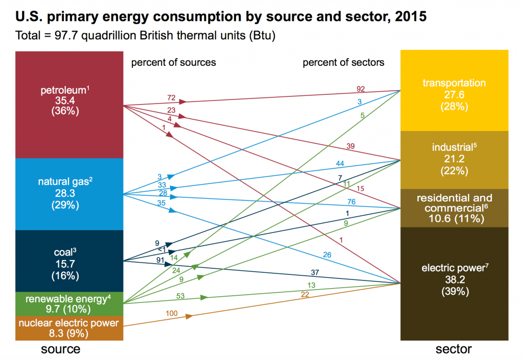
This chart shows really well how petroleum products are fundamental for the transportation sector, how gas is playing a very major role in both industrial and residential and commercial uses, and how nuclear is 100% used to produce electricity in the US; there are some cases where heath from nuclear fission is used for industrial and residential environments here in Switzerland (Beznau and Gösgen NPP).
The EIA newsletters are always a very nice source for information, though they are mostly focused on the USA. Still, they represent trends of the country with probably the most advanced technology in the energy space, so we can always learn a lot from this information.
Here is the full text of today’s “Monthly Energy Review” newsletter:
PRIMARY ENERGY SOURCE-TO-SECTOR CHART — May 31, 2016
U.S. Energy Information Administration releases 2015 U.S. primary energy consumption chart
EIA’s newly updated source-to-sector chart shows the disposition of the 98 quadrillion Btu of energy consumed in the United States in 2015. The chart illustrates how much petroleum, natural gas, coal, renewable energy, and nuclear electric power is distributed to the electric power sector and the end-use sectors.
The chart shows that in 2015:
- The electric power sector was the only consumer of nuclear electric power and the largest consumer of coal (91% of total coal consumption), renewable energy (53% of total renewable energy consumption), and natural gas (35% of total natural gas consumption.).
- Seventy-two percent of all petroleum consumption was used by the transportation sector, where it supplied almost all (92%) of the sector’s energy needs.
- Natural gas supplied 76% of the primary energy used by the residential and commercial sectors and 44% of the primary energy used by the industrial sector.
The primary energy source-to-sector chart is based on energy statistics from the Monthly Energy Review, which provides monthly and annual data on total energy production, consumption, and trade; energy prices; overviews of petroleum, natural gas, coal, electricity, nuclear energy, renewable energy, and international petroleum; carbon dioxide emissions; and data unit conversions.